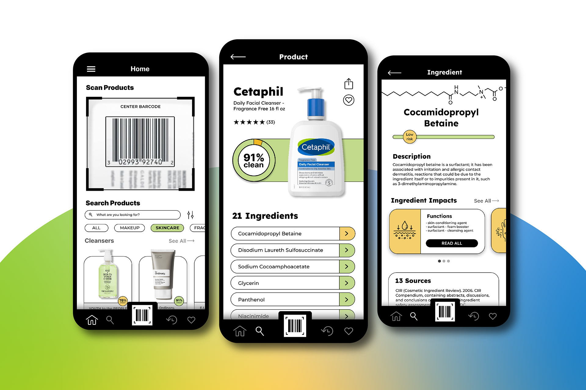
Personal Care Ingredient Scanner App Redesign
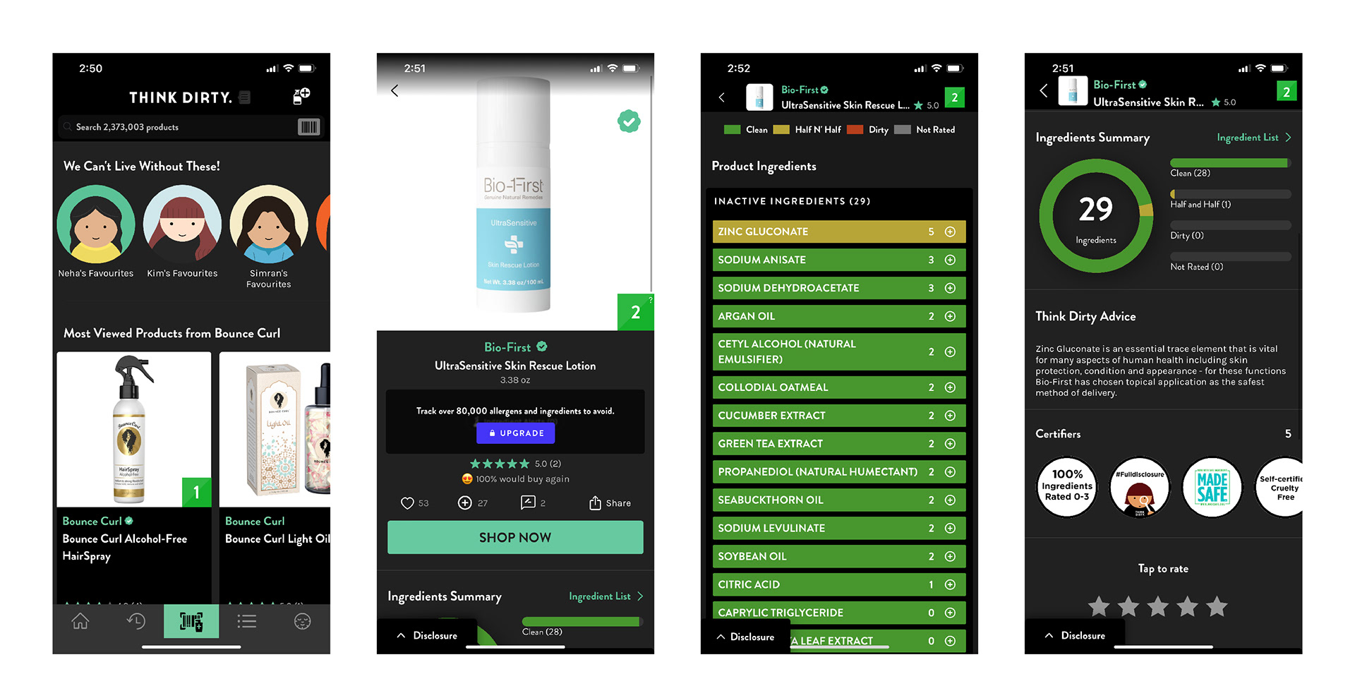
Redesigned App Name: ThinkDirty.
Main Task: Discover harmful ingredients in personal skincare products
Case Study
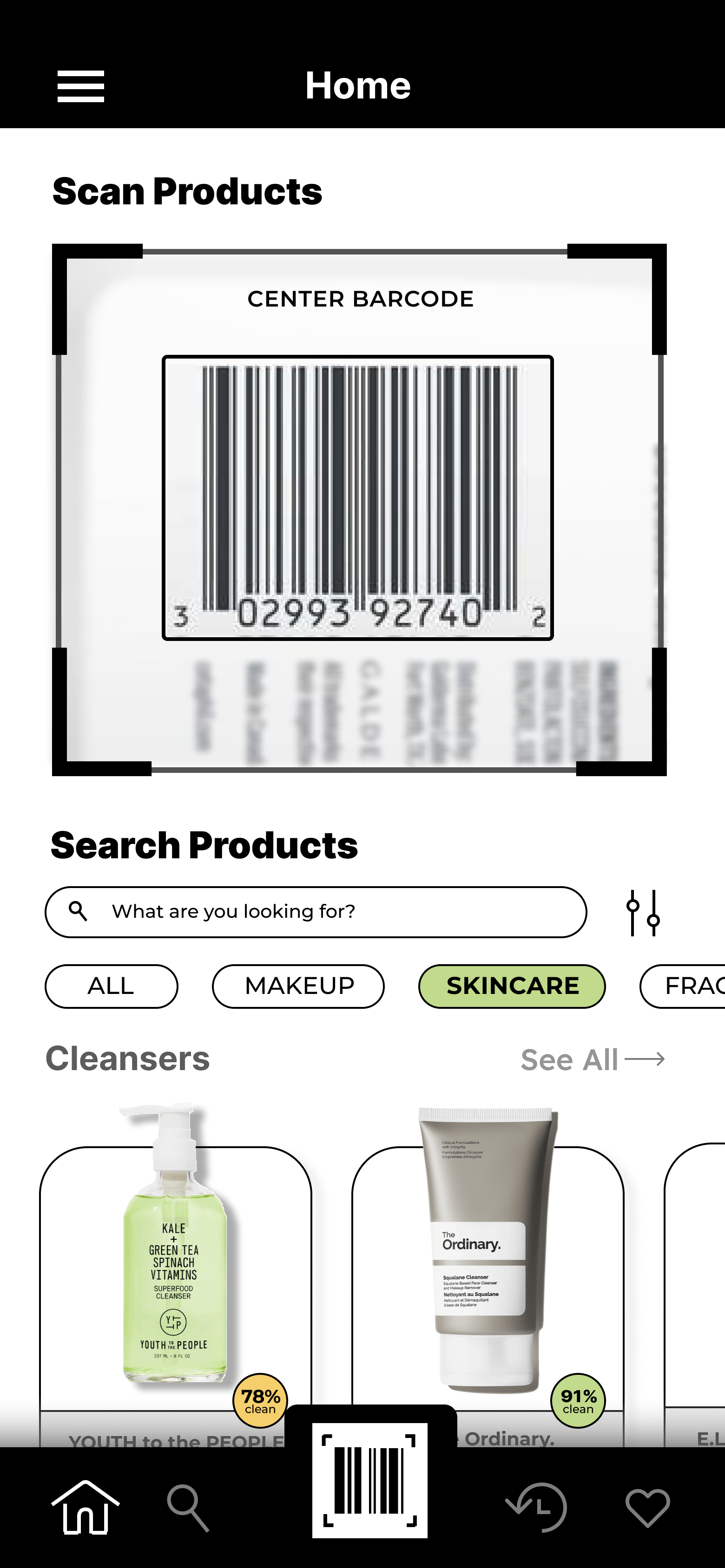
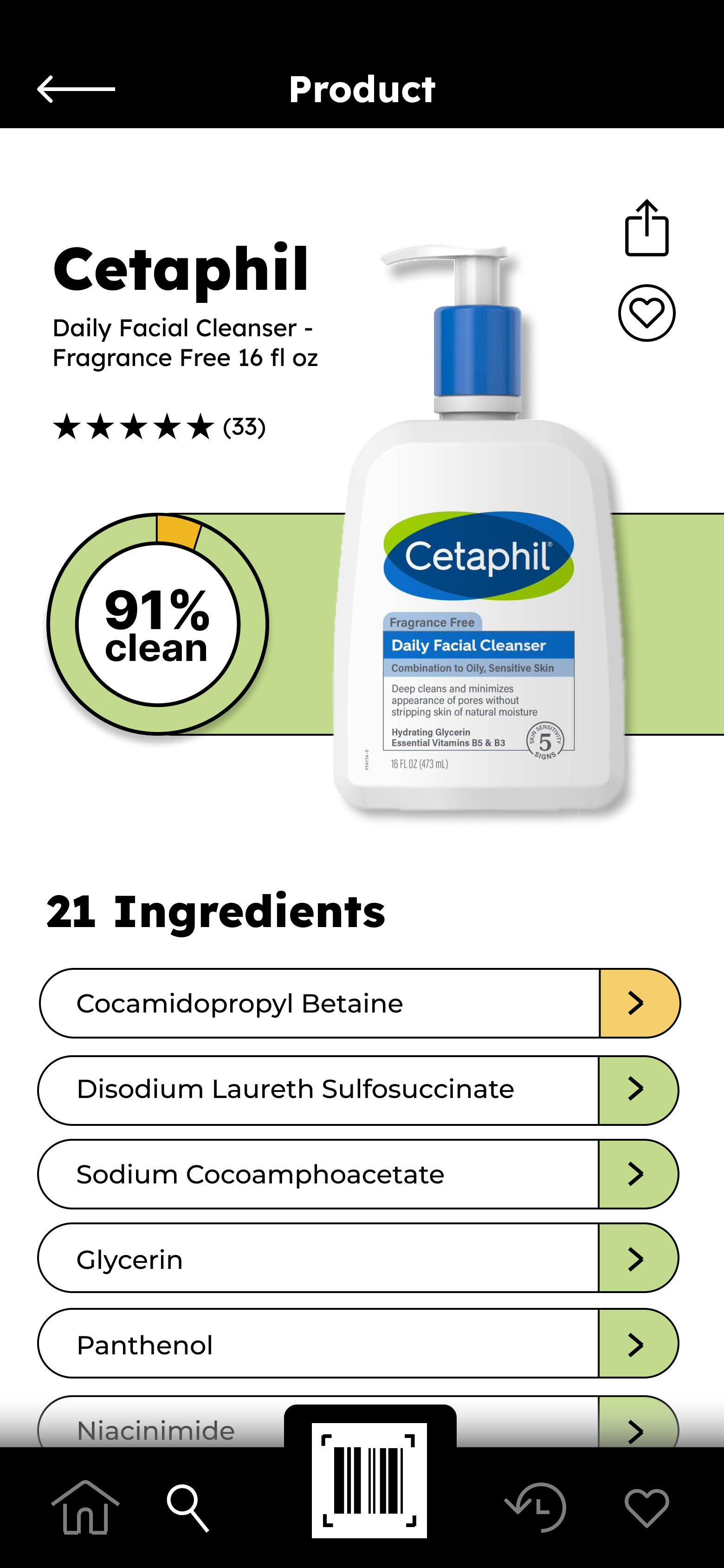
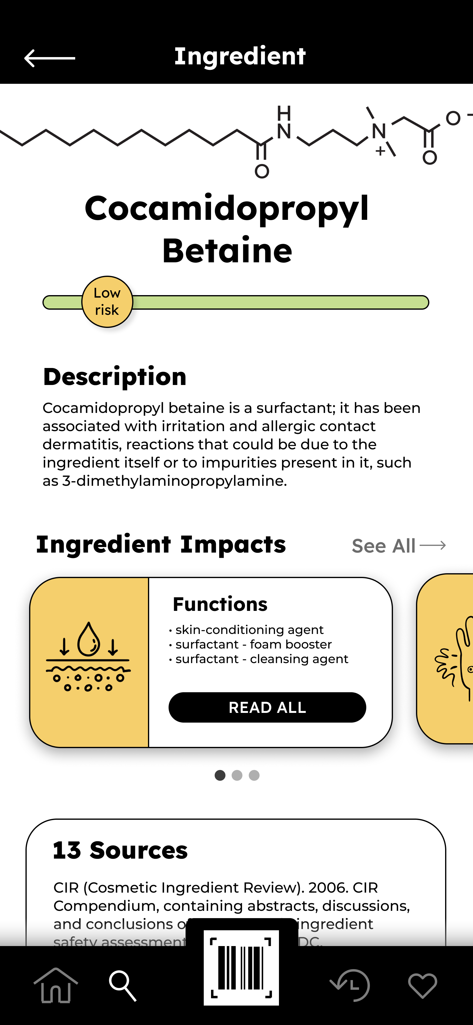
Task Flow: 1) Scan or search product > 2) Review overall product rating > 3) Review health concerns to determine cleanliness
Content Issues: There's too much content on the home screen, which is overwhelming and often both unnecessary and misleading. For example, this includes the sections "We can't live without these!" and "How do you take your coffee". There is no indication of who the names listed under "we" are, which does not provide trustworthy doctor certification to users. Additionally, the "How do you take your coffee" section displays products that do not contain coffee ingredients, which is misleading and irrelevant as a whole.
When viewing a product's ingredient summary, there is a section called "Think Dirty Advice", which gives users information on the ingredient examination, which serves as a disclaimer, not advice. The disclaimer is also unnecessarily long and can be cut down to a sentence rather than a paragraph. A word reduction will help eliminate repetitiveness, as the same disclaimers are listed under each product screen.
Under the ingredient summary on a product screen, is a section titled, "Our Picks" in which the picked products listed are not in the same category as the product being viewed. For example, when viewing a laundry detergent product, there will be face masks and hair oil listed as a top pick rather than other detergent products that might offer a cleaner alternative.
Organizational Issues: There is a lack of menu or navigation bar on the home screen, requiring the user to either scan or search for all products. This is a critical issue because with scanning being the most emphasized navigation to find products, not all users searching have a physical one with them to scan. Many users use the app to compare products to decide which one to shop for, so a navigation bar will benefit all users best.
Main product categories including fragrances, foundation, and shampoo are not largely displayed on the home screen, requiring the user to horizontally scroll until they find the category they're looking for. There is also a lack of unity within category titles, as most are plural, but some are singular. Additional sections under the main categories require a lot of scrolling to get through all the content to reach the end of the screen.
Visual Design Issues: There is a loss of visual hierarchy, as the category titles should be larger in size and shortened to decrease reading time. Category pictures and image titles are often larger than the category title itself. Some contrast between colors make the text hard to read and look at. When displaying the cleanliness of a product's ingredient list, the bright red, yellow, and green indicating its cleanliness behind the white text is harsh. There is low contrast between the color of the search bar and background. This makes the search bar almost invisible and hard to see at first glance. The gray lines separating each category on the home screen blends into the black background as well.
Usability Issues: The ingredient summary is not the first information seen when tapping on a product. This impacts the ease of use because the user is wanting to learn about the cleanliness of a product and any harmful ingredients on the initial screen without further scrolling. Instead, the first information a user sees when tapping on a product is an upgrade button to unlock harmful allergens and a button to buy the product. The clean ingredients are also the first ones listed; the harmful ingredients should be shown first because those are ultimately the deal breakers when analyzing a product. Additionally, the same upgrade button takes up the entirety of the screen when tapping on the ingredient list, requiring more scrolling to read health impacts of a certain ingredient.
ThinkDirty App
Sketches

Final Screen Designs